Pike Construction ServicesUniting legacy + growth: Rebranding for the next 150 years
Despite its size and success, Pike faced a critical challenge: brand fragmentation. Internally, teams operated under different names. Externally, customers lacked a clear understanding of Pike’s full range of capabilities.
Services
- Primary + secondary research
- Brand evolution
- Brand structure + hierarchy
- Brand design + messaging
The goal of this marketing campaign was unifying the construction brand’s identity to position it for the future
As the company approached its 150th anniversary, leadership saw an opportunity: unify the brand to honor its legacy while positioning it for the future.
White Pike logo design over blue-tinted photograph
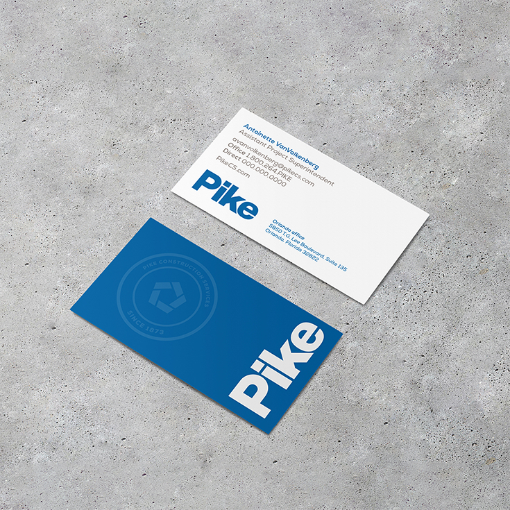
Construction company logo design on a business card, then standalone logo design variations to showcase brand framework
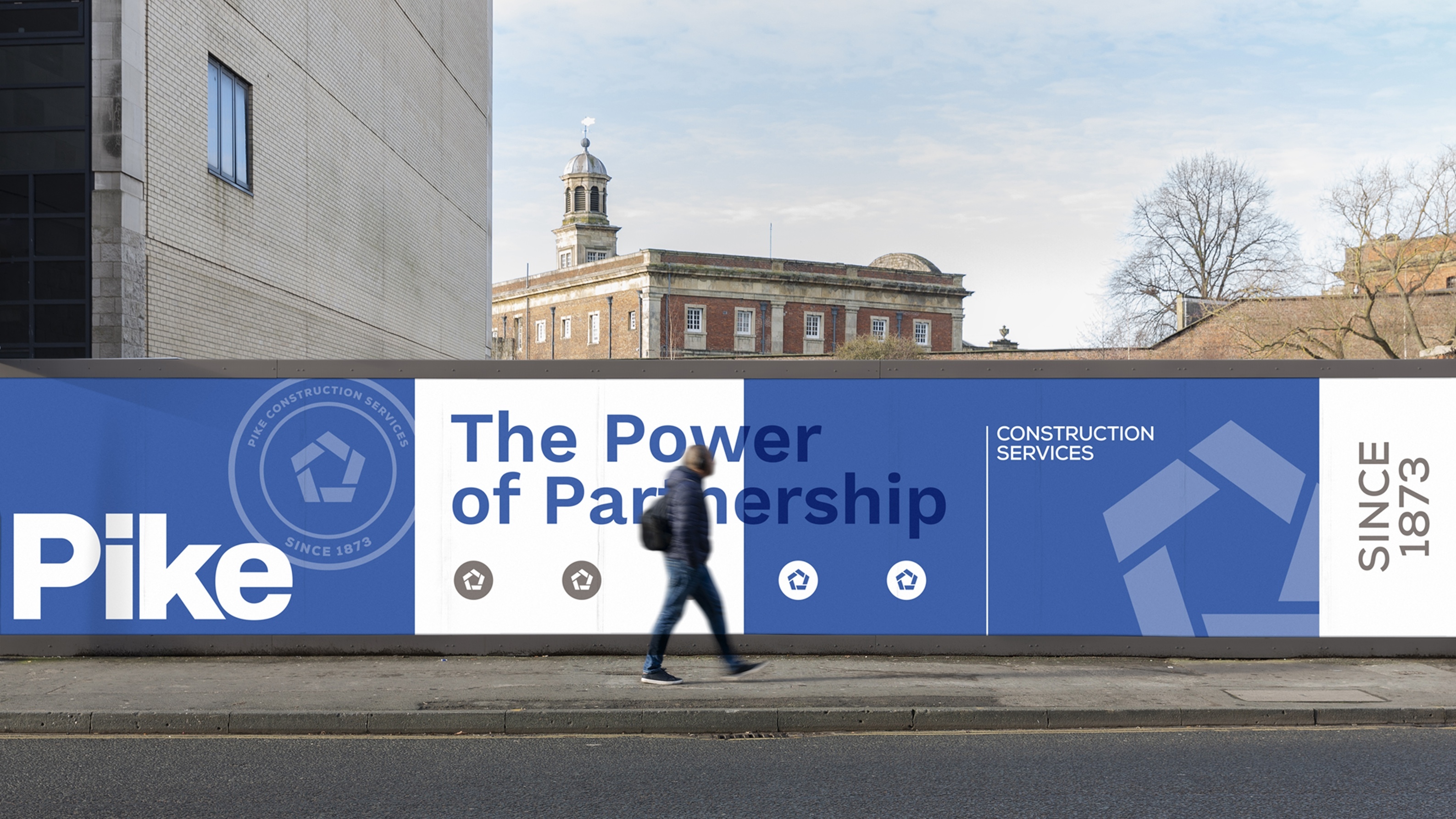
A new logo, tagline, and strategic seal refined the brand while reviving its original 1873 logo
By refining its brand framework, Pike brought three distinct divisions under one cohesive identity, strengthening shared values and market presence. The rebrand introduced a bold new logo, the tagline “Power of Partnership,” and a strategic seal reinforcing both heritage and vision. To mark 150 years of innovation, Pike also revived its original 1873 logo, deepening employee connection to its storied legacy.
Construction company logo designs in situation on a fence wrap
Construction company seal and logo design variations for web
Close-up image of the seal design embroidered on fabric
Key Elements
- Clarity + unity for three disconnected brands
- A series of agency-run workshops with Pike leadership
- A flexible + fluid design process that gained generational alignment
- Illustration of the brand in situation
- A brand that’s structured for next-gen expansion